Olan argo farm

My Role:
Brand Designer - Branding, Packaging.
Timeline:
4 weeks

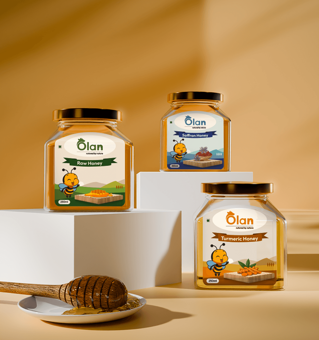
The primary goal of this project was to establish a distinctive and cohesive brand identity for Olan Farm. This involved creating a unique logo, selecting a consistent color palette and typography, and defining a visual language that reflects the brand’s values and vision. In the first phase, we also focused on product packaging design—ensuring that each item not only aligns with the overall branding but also stands out on shelves, communicates quality, and appeals to the target audience.


The green color was chosen for the Olan Farm brand because it symbolizes nature, growth, and sustainability. As a farm-focused brand, green effectively represents freshness, health, and a strong connection to agriculture. It also evokes trust and environmental responsibility, reinforcing Olan Farm’s commitment to natural and eco-friendly practices.


I utilized a diverse color palette to differentiate product variations, ensuring each hue corresponds to the specific flavors used in the products. This creates a visually intuitive system, making it easier for customers to identify flavors at a glance. The color choices enhance brand identity while reinforcing the natural and fresh essence of each product.